Dynamic GUI Editor
Dynamically generated GUIs are used in various plugins. These can be created and edited easily using the Dynamic GUI Editor. To further support user interaction, rules can be applied to GUI elements. This allows the content and functionality of other elements to be controlled in a targeted manner.
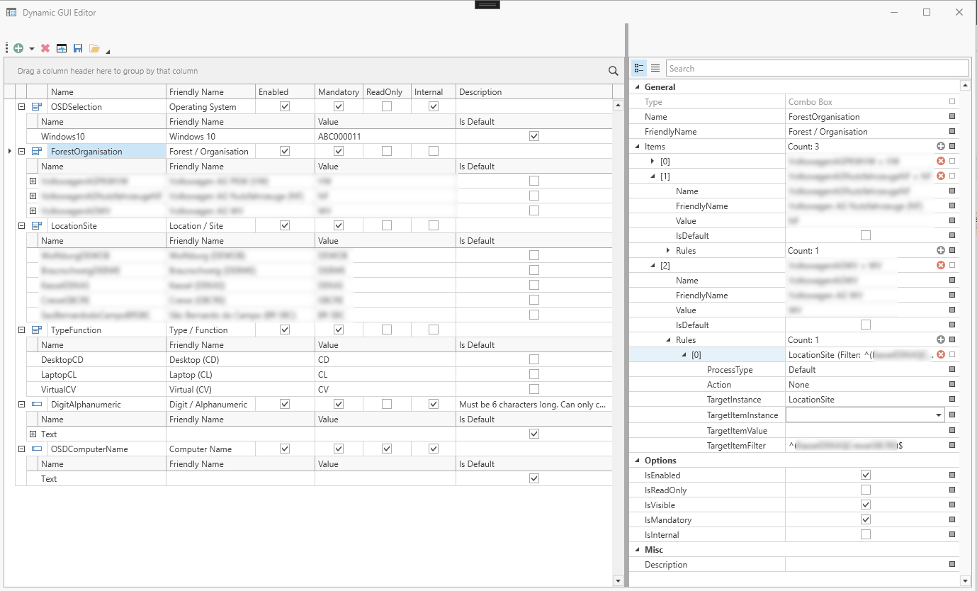
On the left-hand side, you can see an overview of all configured controls and expand them. The hierarchy is as follows: Controls --> Items --> Rules
When a control is selected on the left, a property grid appears on the right where all settings can be configured.
Controls
Every control has properties. These can be viewed and edited in the right-hand pane. Changes are immediately visible in the design view. Each element has a name, which is used for identification within a GUI and must therefore be unique. The programme ensures this. If you attempt to assign a name that has already been used to an element, it will automatically be changed to a valid value.
FriendlyName is the label to be displayed in the GUI.
Textbox
Text boxes have three specific properties:
- ReadOnly, specifies whether the user is permitted to edit the text entered.
- Mask, an input mask to assist with data entry, for example __:__:__:__
- Validation Regex, here you can enter a regular expression to be used for validating the input.
Mask
Mask tokens can be defined under ‘Mask’. This determines the formats of the input fields.
| Mask-Token | Attribute |
| A | Alphanumeric or a special character; required. |
| a | Alphanumeric or a special character; not required. |
| L | Letter, required. Restricts input to the ASCII letters a–z and A–Z. This mask element is equivalent to [a-zA-Z] in regular expressions. |
| l | Letter, not required |
| \ | Escapes a mask character and converts it to a literal. ‘\’ is the escape sequence for a backslash. |
| All other characters | (Literals) All non-mask elements are displayed as they are in RadMaskedTextInput. Literals always occupy a fixed position within the mask at runtime and cannot be moved or deleted by the user. |
For more information, see Telerik Mask Tokens.
An example of a field for entering a MAC address: AA-AA-AA-AA-AA-AA
Regex validation
The Regex validation feature allows you to restrict the characters permitted in the input field.
An example of a Regex that only allows letters from A to F for entering a MAC address:
^[{]?[0-9a-fA-F]{8}-([0-9a-fA-F]{4}-){3}[0-9a-fA-F]{12}[}]?$
Elements marked as “Internal” are essential to the functioning of a plug-in. If these are deleted or their names are changed, the plug-in in question may no longer function correctly.
Combobox entries
The Default property can be used to define a value as the default value. Only one element can be defined as the default value. If a new element is marked as the default, this property is automatically set to False for the previous one.
The value for internal use is defined via Value.
Empty creates an empty selection element in the display.
The same applies to the items in a ComboBox: their names must be unique within the ComboBox. If an attempt is made to assign a duplicate name, the programme will automatically change it to a valid value.
Rules
The rules concept is an integral part of dynamic GUIs. Rules make it possible to link the selection of a combo box element to further actions that are executed automatically. For example, a value can be selected from another combo box, or the content of a text field can be changed. A combo box element can contain n rules.
Structure
A rule consists of several pieces of information:
- The parent GUI element.
- The triggering element.
- The target GUI element.
- The content to be set.
- An action that describes what should happen to the target.
- With the exception of the parent GUI element, all settings can be edited at a later stage.
Filtering of drop-down list entries
There is a new configuration setting within the rule sets for combo boxes called ‘TargetItemFilter’. A regular expression can be specified here. This causes the contents of a combo box target to be filtered based on the name.
Important: Filtering is based on the assigned names of the configured combo box items, not on the Value or Friendly Name.
- Example 1:
- Combobox entries for the target: DEWOB, DEBWE, DEKAS, GBCRE
- TargetItemFilter: (DEWOB|DEKAS)
- Result: DEWOB, DEKAS
- Example 2:
- Combobox entries for the target: DEWOB, DEBWE, DEKAS, GBCRE
- TargetItemFilter: (.*)
- Result: All entries, as .* matches everything
Dynamic textbox values
- Combobox 1 selection: VW (Name = ForestOrganisation)
- Combobox 2 selection: DEWOB (Name = LocationSite)
- Combobox 4 selection: CD (Name = TypeFunction)
- Text box imput: 123456 (Name = DigitAlphanumeric)
- Target-Textbox: OSDComputerName
- TargetItem: {ForestOrganisation}{LocationSite}{TypeFunction}{DigitAlphanumeric}
- Value determined for OSDComputerName: VWDEWOBCD123456
- Setting `ProcessType = Default` means that the rule only applies when the associated combo box item is clicked.
Setting `ProcessType = All` means that the rule applies whenever a value is changed (across all existing controls).
XML definitions
The configuration is saved in XML format and can be imported into a compatible plugin configuration.
The underlying XML definition is a general format for describing configurable graphical interfaces within SCCM Manager.
The structure of a sample configuration is explained below.
The definition has been supplemented with some new parameters and may therefore be incomplete.
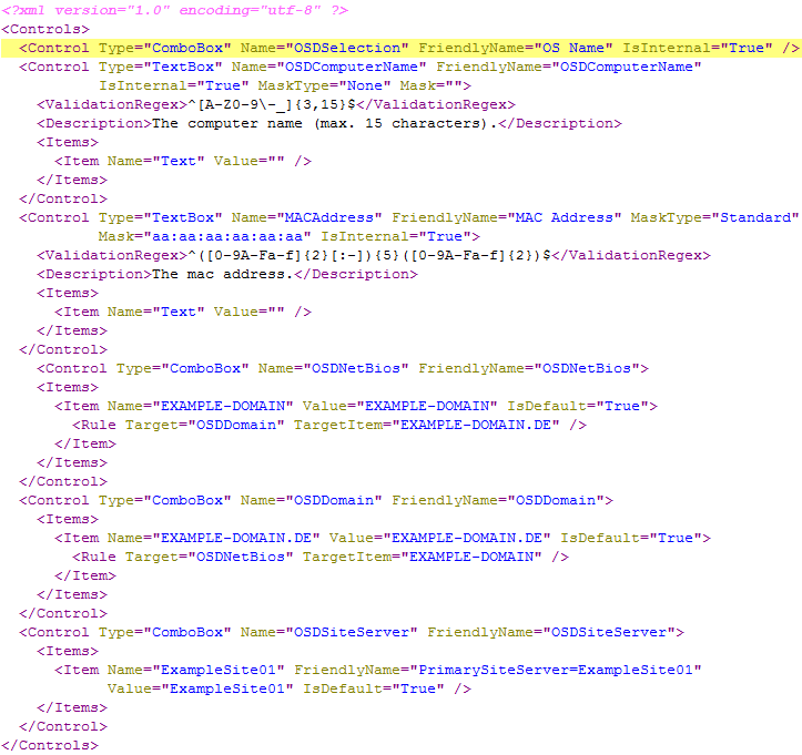
- Any number of controls can be defined. Currently, two types can be defined: “TextBox” and “ComboBox”.
- A name must be defined for each control. This name must be unique, must not contain any spaces, and has three functions (in the Client Creator example).
- Internal name of the control, to enable it to be controlled via a rule.
- Name of the computer variable.
- Label of the control, if no FriendlyName has been defined
- You can also define a FriendlyName, which is then used as a label in the GUI.
- Each control can optionally include a description tag. A description can be entered there, which is then displayed as a tooltip above the relevant control.
- Each control can have any number of items.
- An item must have a name and may optionally have a FriendlyName for display purposes (otherwise the name is used automatically).
- In the case of a ComboBox, the item should also have a Value. In the Client Creator example, this is the value of the computer variable.
- The default item of a ComboBox can be set using the IsDefault attribute. Otherwise, none is selected by default.
- Each item can have any number of rules. As soon as this item is subsequently selected in the GUI, all rules assigned to it take effect.
- A rule always defines a Target, i.e. the name of the control that is to be affected.
- A TargetItem is also defined, e.g. the item that is to be automatically selected in another ComboBox.
- Optionally, a so-called Action can also be defined. There are currently four different ones: ‘Show’, ‘Hide’, ‘Enable’, ‘Disable’. This allows other controls to be affected as well.
- A text box can also have additional attributes and tags.
- A mask can be defined by setting the ‘Mask’ and ‘MaskType’ attributes (see example).
- An additional ‘ValidationRegex’ tag can be added. This enables the text box to validate user input automatically.
- Furthermore, a text box only recognises its first item. This is essential to ensure that a value exists at all and to be able to access it, for example, via a rule.
- This system can also be used for custom plugins
Sample configuration and the resulting GUI
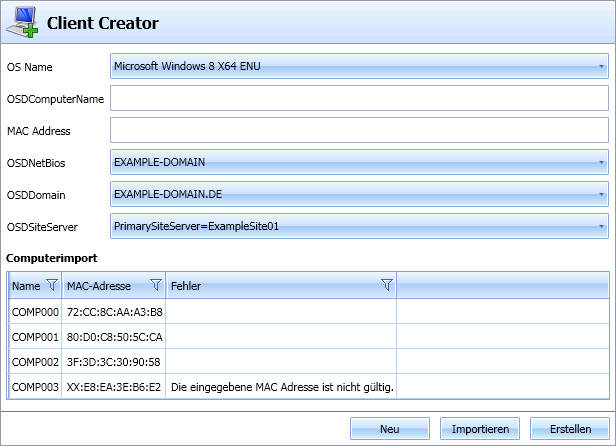
- The first control in the image (OS Name) is part of the Client Creator internally.
- The computer name as a text box (also internal): the regular expression (ValidationRegex) expects uppercase letters.
- NetBIOS domain as a combo box: the corresponding rule automatically selects the matching FQDN.
- Primary Site Server: The FriendlyName for the control is PrimarySiteServer=ExampleSite01, but the variable value (Value) ExampleSite01 is actually selected later. This also applies to the variable name, which is later set to OSDPrimarySiteServer.