Dynamic GUI Editor
The Dynamic GUI Editor is a tool of the SCCM Manager. It is used to configure dynamically generated user interfaces for certain plugins. These include the Client Creator Plugin, Reset Computer Plugin and the Custom Inventory Plugin. This allows the content and function of other elementscontrols to be specifically designed and controlled.
|
Update
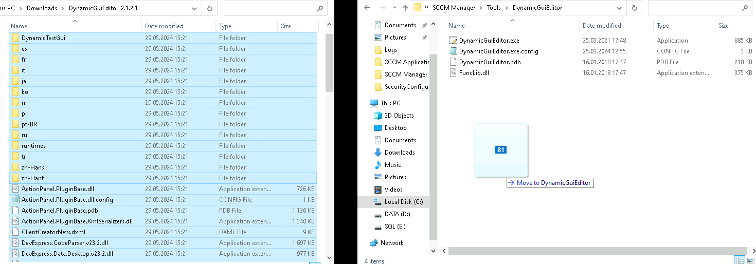
The Dynamic GUI Editor is supplied with the SCCM Manager installation. When installing a newer version, only the files need to be exchanged.
The Dynamic GUI Editor files are by default located under:
"C:\Program Files (x86)\smcTeam\SCCM Manager\Tools\DynamicGuiEditor".
The existing files must be replaced with the new files.
After the files have been exchanged, on the first start of the Dynamic GUI Editor a Microsoft Defender message may appear. Press the “Run Anyway” button to continue.
Layout
Configuration
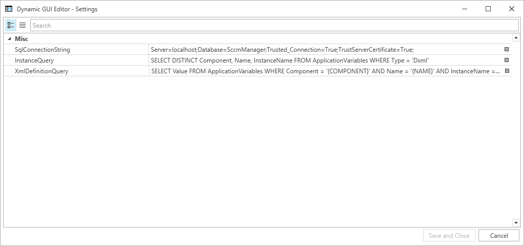
The configurations should ideally not be changed and are set correctly by default.
| Value | Explanation | Default Value |
| SqlConnectionString |
This ConnectionString is used to establish the connection to the SCCM Manager database. |
Server=localhost;Database=SccmManager;Trusted_Connection=True;TrustServerCertificate=True; |
| InstanceQuery |
This Query is used to determine the different Instances in the SCCM Manager database. |
SELECT DISTINCT Component, Name, InstanceName FROM ApplicationVariables WHERE Type = 'Dxml' |
| XmlDefinitionQuery |
This Query is used to get the different Xml from the SCCM Manager database. |
SELECT Value FROM ApplicationVariables WHERE Component = '{COMPONENT}' AND Name = '{NAME}' AND InstanceName = '{INSTANCE}' |
Plugin
Create New GUI
TheAfter starting the Dynamic GUI Editor isnew usedcontrols can be added to configurethe canvas to create a new GUI.
Deleting controls
Via the user"Delete" interface of these plugin,button the Clientselected Creatorelement Plugin,can Resetbe Computerdeleted Plugin andfrom the Customcanvas.
Testing GUI
The pluginsGUI havecan specificbe requirements of element that needtested, to besee presenthow it will look in the GUI.
Clear
| |
Dynamic GUI Editor
Saving
The user interfaces created with the Dynamic GUI Editor can be loaded and saved as a file or in the SCCM Manager database in the "ApplicationVariables" table.
The GUIs must be saved in the database in order to be used by the SCCM Manager.
Control Overview
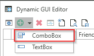
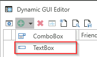
InComboBoxes
the ComboBoxesoverview all controls and there settings can be addedseen viaand the "Add" button.
selected.
The new ComboBox is created at the bottom.
| Name | Explanation |
| Name | The name used internally by the Dynamic GUI Editor |
|
Friendly Name |
The name that will be shown to the user |
| Enabled | Determines if the element will be shown in the user interface |
| Mandatory | Determines if the element needs to be filled out |
| Read Only | Determines if the element can be edited |
| Internal | Elements marked as Internal are essential for the functionality of a plug-in. If these are deleted or their name is changed, the function of the respective plug-in can no longer be guaranteed. If the element is not marked as internal the value will be created as a computer variable in SCCM |
| Description | The text will be shown as tool tip when hovered over the element |
Properties
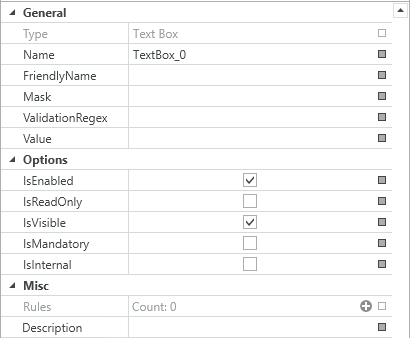
The ComboBoxcontrols can be editedconfigured in the settings menu. There are some small differences in the settings between ComboBoxes and TextBoxes.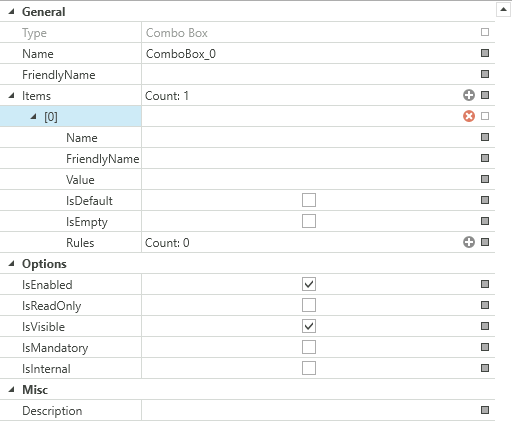
| Setting | Explanation |
| Type | Indicates whether the control is a ComboBox or a TextBox. Can not be changed |
| Name | The name used internaly by the Dynamic GUI Editor |
|
FriendlyName |
The name that will be shown to the user |
|
Mask (TextBoxes only) |
Masks can be defined under " |
|
ValidationRegex (TextBoxes only) |
The validation regex can be used to limit the characters allowed in the input. |
|
Value (TextBoxes only) |
The value will be pre-assigned |
| Item (ComboBox only) | More information on ComboBox Items down below |
|
IsEnabled |
If True, the control can not be edited active/enabled |
| IsReadOnly |
If True, the control can not be edited |
| IsVisble | If True, the control will be shown in the user interface |
| IsMandatory | If True, the control the element needs to be filled out |
| IsInternal |
Controls marked as "Internal" are essential for the functionality of a plug-in. If these are deleted or their name is changed, the function of the respective plug-in can no longer be guaranteed.
If the element is not marked as internal the value will be created as a computer variable in SCCM |
| Description | The description text will be shown as tool tip when hovered over the element |
ComboBox Items
ComboBoxes can have n-many ComboBox Items. The Items have their own properties and can be assigned rules.
ComboBox Items can have Rules assigned to them. Rules can be provided to further support user interaction.
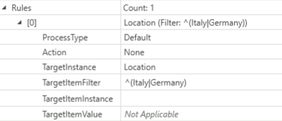
In this example the ComboBox Item has a rule that will define the selectable Item from the ComboBox "Location".
| Rule | Explanation |
| ProcessType |
Default All |
| Action |
With "Action" additional actions can be configured.
None - No additional action will be done Enable - Enable the TargetInstance Disable - Disable the TargetInstance Show - Show the TargetInstance Hide - Hide the TargetInstance Set Read Only - Sets the TargetInstance to read only Set Writeable - Sets the TargetInstance to writeable |
| TargetInstance | The UI element that is target by the selection of the item, in tis case another ComboBox Named "Location". |
| TargetItemFilter | Used to limit the selection of antoher ComboBox, in this Example the ComboBox "Location", will only display the Items "Italy" and "Germany". |
| TargetItemInstance | |
| TargetItemValue | Can not be used via a ComboBox Item |
TextBoxes
TextBoxes can be added via the "Add" button.
The new TextBox is created at the bottom.
| Name | Explanation |
| Name | The name used internaly by the Dynamic GUI Editor |
|
Friendly Name |
The name that will be shown to the user |
| Enabled | Determines if the element will be shown in the user interface |
| Mandatory | Determines if the element needs to be filled out |
| Read Only | Determines if the element can be edited |
| Internal | Elements marked as Internal are essential for the functionality of a plug-in. If these are deleted or their name is changed, the function of the respective plug-in can no longer be guaranteed. If the element is not marked as internal the value will be created as a computer variable in SCCM |
| Description | The text will be shown as tool tip when hovered over the element |
The TextBox can be edited in the "General" tab.
MaskPlugin Requirements
The Dynamic GUI Editor is used to configure the user interface of these plugin, the Client Creator Plugin, Reset Computer Plugin and the Custom Inventory Plugin. The plugins have specific requirements of controls that need to be present in the GUI.
| Plugin | Requirements |
| Client Creator Plugin |
OSDSelection - ComboBox MACAddress - TextBox SMBIOSGUID - TextBox |
| Reset Computer Plugin | OSDSelection - ComboBox |
| Custom Inventory Plugin | inv_number - TextBox |
Masks
Masks can be defined under "Mask". This defines the formats of the input fields.
| Mask | Property |
| A | Alphanumeric or a special character, required. |
| a | Alphanumeric or a special character, not required |
| L | Letter, required. Restricts the input to the ASCII letters a-z and A-Z. This mask element is equivalent to [a-zA-Z] in regular expressions. |
| l | Letter, not required |
| \ | Breaks out a mask character and turns it into a literal. "\" is the escape sequence for a backslash. |
| All other characters | (Literals) All non-mask elements are displayed in RadMaskedTextInput as themselves. Literals always take a static position in the mask at runtime and cannot be moved or deleted by the user. |
More information at Telerik Mask Tokens.
An example of a mask for entering a MAC address:
AA-AA-AA-AA-AA-AA
Validation regex
The validation regex can be used to limit the characters allowed in the input.
An example of a regex that allows only letters from A to F, for entering a MAC address:
^[{]?[0-9a-fA-F]{8}-([0-9a-fA-F]{4}-){3}[0-9a-fA-F]{12}[}]?$
TextBoxes can be assigned Rules.
In this example the TextBox "DigitalAlphaNummeric" has a rule that will give the TextBox "OSDComputerName" its value.
| Rule | Explanation |
| ProcessType | |
| Action | |
| TargetInstance | The Element that will be targeted by the rule, in this case the TextBox "OSDComputerName". |
| Target Value |
The TargetValue is the value that be will written in the target TextBox, in this Case it will be the combination from the "Location" and "Type" ComboBoxes and the value of the "DigitalAlphanummeric" TextBox. Seperated by { }. |
XML Definition
The underlying XML definition is a general format for describing configurable graphical interfaces within the SCCM Manager.
The following explains the structure of the configurationGUI filefor "ClientCreater_OSDVariables.xml"the Client Creator Plugin.
- You can define n-many controls. Two types can currently be defined: “TextBox” and “ComboBox”.
- A name must be defined for each control. This must be unique, may not contain any spaces and has three functions (in the example Client Creator).
-
Internal name of the control to be able to control it by rule.
-
Name of the computer variable.
-
Label of the control, if no FriendlyName was defined.
-
-
In addition, a FriendlyName can be defined, this then serves as a label in the GUI.
-
Each control can optionally contain a description tag. A description can be stored there, which is then displayed as a tooltip above the respective control.
-
Each control can have n-many items.
-
An item again needs a mandatory name and optionally a FriendlyName to represent it (otherwise the name is used automatically).
-
In a ComboBox, the item should also have a value. In the Client Creator example, this is the value of the computer variable.
-
The default item of a ComboBox can be set via the IsDefault attribute. Otherwise, none is initially selected.
-
Each item can have n-many rules. As soon as this item is selected later in the GUI, all rules assigned to it are applied.
-
A target is always defined in a rule, i.e. the name of the control that is to be influenced.
-
In addition, a TargetItem is defined, e.g. the item that is to be automatically selected in another ComboBox.
-
Optionally, a so-called action can also be defined. There are currently four different ones: "Show", "Hide", "Enable", "Disable". This can be used to additionally influence other controls.
-
-
-
A TextBox can also have additional attributes and tags.
-
A mask can be defined, for this the attributes "Mask "and "MaskType "can be set (see example).
-
An additional tag "ValidationRegex" can be added. This gives the TextBox the possibility to validate itself on user input.
-
Furthermore, a TextBox recognizes only its first item. This is absolutely necessary so that there is a value at all and to be able to access it via a rule, for example.
-
-
For custom plugins this system can also be used
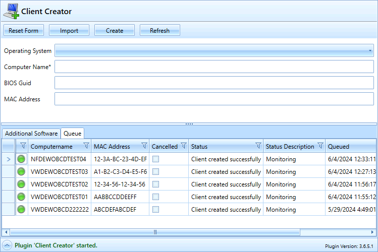
Example configuration and the GUI generated from it
<Controls>
 <Control Type="ComboBox" Name="OSDSelection" FriendlyName="Operating System" IsEnabled="True" IsMandatory="False" IsVisible="True" IsInternal="True">
  <Items />
  <Description></Description>
 </Control>
 <Control Type="TextBox" Name="OSDComputerName" FriendlyName="Computer Name" IsEnabled="True" IsMandatory="True" IsVisible="True" IsInternal="True" IsReadOnly="False" Mask="">
  <ValidationRegex>^[A-Za-z0-9\-_]{3,15}$</ValidationRegex>
  <Items>
   <Item Name="Text" Value="" IsDefault="True" />
  </Items>
  <Description>The computer name (max. 15 characters).</Description>
 </Control>
 <Control Type="TextBox" Name="SMBIOSGUID" FriendlyName="BIOS Guid" IsEnabled="True" IsMandatory="False" IsVisible="True" IsInternal="True" IsReadOnly="False" Mask="">
  <ValidationRegex>^[{]?[0-9a-fA-F]{8}-([0-9a-fA-F]{4}-){3}[0-9a-fA-F]{12}[}]?$</ValidationRegex>
  <Items>
   <Item Name="Text" Value="" IsDefault="True" />
  </Items>
  <Description>The bios guid like 936DA01F-9ABD-4D9D-80C7-02AF85C822A8</Description>
 </Control>
 <Control Type="TextBox" Name="MACAddress" FriendlyName="MAC Address" IsEnabled="True" IsMandatory="False" IsVisible="True" IsInternal="True" IsReadOnly="False" Mask="">
  <ValidationRegex>^([0-9A-Fa-f]{2}[:-]?){5}([0-9A-Fa-f]{2})$</ValidationRegex>
  <Items>
   <Item Name="Text" Value="" IsDefault="True" />
  </Items>
  <Description>The mac address.</Description>
 </Control>
</Controls>-
The ComboBox "Operating System" belongs internally to the Client Creator. It does not have predefined values but gets them from the query configured in the ClientCreatorPlugin. The ComboBox is internal.
-
The computer name as TextBox, also internal has a regular expression (ValidationRegex) that expects at least 3 and at most 15 characters, uppercase letters, lowercase letters, numbers, - and _ are allowed.
-
NetbiosThedomainTextboxas"BIOSComboBox: the corresponding FQDNGuid" isautomatically selectedneeded by theassociatedclientrule.creator plugin but can be left empty if a MAC Address is entered instead.
The regex checks that the entered text is in an valid GUID format. -
PrimaryMACSiteAddressServer:isTherequiredFriendlyName forby thecontrolclient creator plugin, but can be left empty if a SMBIOS GUID isPrimarySiterServer=ExampleSite01,enteredbutinstead.
TheactuallyregextheonlyvariableallowsvalueaExampleSite01formatwillvalidbeinput.chosen later. This is the same for the variable name, this will be set later as OSDPrimarySiteServer.

