Sever - Dynamic GUI Editor
Dynamically generated GUIs are used in various plugins. These can be conveniently created and easily edited using the Dynamic GUI Editor. GUI elements can be provided with rules to further support user interaction. This allows the content and function of other elements to be controlled in a targeted manner.
Overview
- Layout
- Edit GUI
- Controls
- Rules
- XML definition
Layout
The main window is divided into three areas. On the left are the available controls, in the center is the design view, and on the right are the detailed settings for the selected element.
Edit GUI
Create new
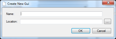
There are several ways to create a new GUI. Via the file menu File -> New or in the menu bar a new empty GUI can be created. A name and the destination must be specified.
It is also possible to create a new GUI as a copy of an existing one. This is done via the context menu of the tab of an already opened GUI. A copy is created in the same directory and all settings including defined rules are transferred 1:1.
Rename
Renaming is done via the context menu of the tab of an opened GUI. Rename opens the corresponding dialog.
Open and close
An existing GUI file can be opened via File -> Open in the file menu or in the menu bar. Closing is done via File -> Close in the file menu, in the menu bar or Close in the context menu of the tab of an open GUI. If the GUI to be closed contains unsaved changes, a query is made.
Add control element
To add an element, the desired element is selected in the selection on the left and placed in the desired position in the design view using drag & drop.
Remove control element
Selected elements can be removed via [Del] or the context menu. There is always a confirmation prompt. When deleting, all rules (see Rules) are automatically deleted which were directly associated with the element or had set it as a target.
Change position
To change the position, the desired elements are selected and dragged & dropped to their new position.
.
Copy and paste
.
Selected elements can be copied using [Ctrl]+[c] or the context menu and pasted again at any position using [Ctrl]+[v] or the context menu. This process is also possible between multiple open GUIs, but no rules are copied along with them, as their consistency can no longer be guaranteed.
Previewing and testing a GUI
.
Here all elements with their set properties and defined rules (see Rules) can be tested and checked for functionality.
Save changes
.
For saving, the functions save and save all are available in the menu bar and in the file menu under File.
.
Controls
Textbox
Text boxes have three specific properties:
- ReadOnly, specifies whether the user is allowed to edit the set text.
- Mask, an input mask to support the input, for example __:__:__:__
- Validation Regex, here a Regular Expression can be set after which the validation of the input takes place.
ComboBox
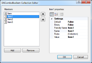
Via  the content of a ComboBox is edited. Here you can add or remove elements or change their position.
Also for the elements of a ComboBox applies, their name must be unique within the ComboBox. If an attempt is made to assign a name twice, the program will automatically adjust it to a valid value.
Properties
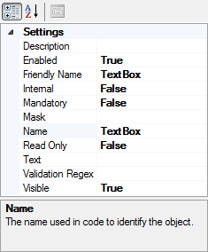
Each control has properties. These can be viewed and edited in the right part. Changes are visible directly in the design view. Each element has a name, which is used within a GUI for assignment and must therefore be unique. This is ensured by the program. If an attempt is made to assign an already assigned name to an element, it will automatically be adjusted to a valid value.
FriendlyName is in each case the label to be displayed in the GUI.
Mask tokens
Mask tokens can be defined under "Mask". This defines the formats of the input fields.
| Mask tokens | Property |
| A | Alphanumeric or a special character, required. |
| a | Alphanumeric or a special character, not required |
| L | Letter, required. Restricts the input to the ASCII letters a-z and A-Z. This mask element is equivalent to [a-zA-Z] in regular expressions. |
| l | Letter, not required |
| \ | Breaks out a mask character and turns it into a literal. "\" is the escape sequence for a backslash. |
| All other characters | (Literals) All non-mask elements are displayed in RadMaskedTextInput as themselves. Literals always take a static position in the mask at runtime and cannot be moved or deleted by the user. |
More information at Telerik Mask Tokens.
An example of a mask for entering a MAC address:
AA-AA-AA-AA-AA-AA
Validation regex
The validation regex can be used to limit the characters allowed in the input.
.
An example of a regex that allows only letters from A to F, for entering a MAC address:
^[{]?[0-9a-fA-F]{8}-([0-9a-fA-F]{4}-){3}[0-9a-fA-F]{12}[}]?$
Elements marked as Internal are essential for the functionality of a plug-in. If these are deleted or their name is changed, the function of the respective plug-in can no longer be guaranteed.
Rules
The rule concept is an integral part of dynamic GUIs. Rules make it possible to link the selection of a ComboBox element with further actions to be executed automatically. For example, a value of another ComboBox can be selected, or the contents of a text field can be changed.
A ComboBox element can contain n rules.
Layout
A rule consists of five pieces of information:
The parent GUI element.
The triggering element.
The target GUI element.
The content to set.
An action that describes what to do with the target.
All settings except for the parent GUI element can be edited later.
Rules overview
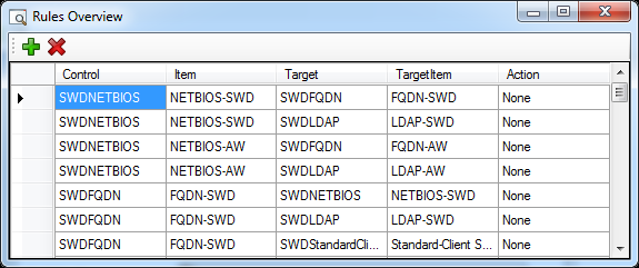
An overview of all rules present in the selected GUI is accessed via ![]() in the menu bar.
in the menu bar.
Add & edit rules
.
There are two different variants available for this purpose. The most convenient option is via the rule overview, the other is via the properties of a ComboBox element.
.
Variant rule overview:
Create new rule
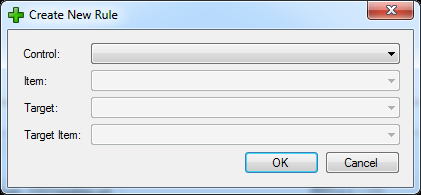
The creation of a new rule is done via in the menu bar. In the following dialog, the desired settings are assigned in each case from top to bottom.
Edit existing rule
To edit a property of the rule, select it in the rule overview and then press [F2] or double-click to switch to edit mode.
Remove rule
To delete one or more rules, they are highlighted and then deleted via  in the menu bar or with [Del]. A confirmation prompt will be displayed.
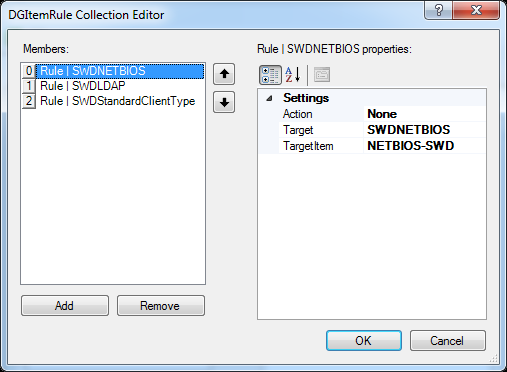
Variant properties of a ComboBox element:
This variant is useful if you want to define rules directly when adding ComboBox elements. Via in the properties of a ComboBox element the rule editor is opened.
Add new rule
A new empty rule is added via ![]() .
.
Edit existing rule
To edit an existing rule, select it in the selection on the left. Then its properties can be edited in the right part of the window
.
Remove rule
To delete one or more rules, they are highlighted and then deleted via ![]() There will be no confirmation prompt.
There will be no confirmation prompt.
XML Definition
The underlying XML definition is a general format for describing configurable graphical interfaces within the SCCM Manager.
.
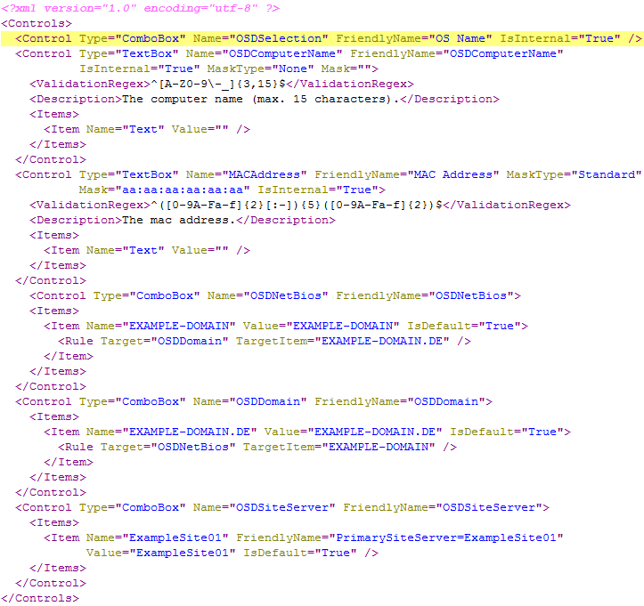
The following explains the structure of the configuration file "ClientCreater_OSDVariables.xml"
.
- You can define n-many controls. Two types can currently be defined: “TextBox” and “ComboBox”.
- A name must be defined for each control. This must be unique, may not contain any spaces and has three functions (in the example Client Creator).
-
Internal name of the control to be able to control it by rule.
-
Name of the computer variable.
-
Label of the control, if no FriendlyName was defined.
-
-
In addition, a FriendlyName can be defined, this then serves as a label in the GUI.
-
Each control can optionally contain a description tag. A description can be stored there, which is then displayed as a tooltip above the respective control.
-
Each control can have n-many items.
-
An item again needs a mandatory name and optionally a FriendlyName to represent it (otherwise the name is used automatically).
-
In a ComboBox, the item should also have a value. In the Client Creator example, this is the value of the computer variable.
-
The default item of a ComboBox can be set via the IsDefault attribute. Otherwise, none is initially selected.
-
Each item can have n-many rules. As soon as this item is selected later in the GUI, all rules assigned to it are applied.
-
A target is always defined in a rule, i.e. the name of the control that is to be influenced.
-
In addition, a TargetItem is defined, e.g. the item that is to be automatically selected in another ComboBox.
-
Optionally, a so-called action can also be defined. There are currently four different ones: "Show", "Hide", "Enable", "Disable". This can be used to additionally influence other controls.
-
-
-
A TextBox can also have additional attributes and tags.
-
A mask can be defined, for this the attributes "Mask "and "MaskType "can be set (see example).
-
An additional tag "ValidationRegex" can be added. This gives the TextBox the possibility to validate itself on user input.
-
Furthermore, a TextBox recognizes only its first item. This is absolutely necessary so that there is a value at all and to be able to access it via a rule, for example.
-
-
For custom plugins this system can also be used
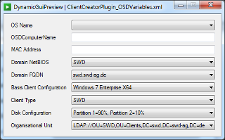
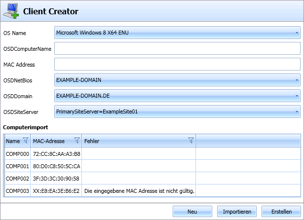
Example configuration and the GUI generated from it
-
The first control in the image (OS Name) belongs internally to the Client Creator.
-
The first control in the image (OS Name) belongs internally to the Client Creator. aThe computer name as TextBox (also internal): the regular expression (ValidationRegex) expects uppercase letters.
-
Netbios domain as ComboBox: the corresponding FQDN is automatically selected by the associated rule.
-
Primary Site Server: The FriendlyName for the control is PrimarySiterServer=ExampleSite01, but actually the variable value ExampleSite01 will be chosen later. This is the same for the variable name, this will be set later as OSDPrimarySiteServer.
